When the brash young startup named "Nothing" burst onto the scene a few years ago, promising to breathe new life into the stale smartphone world with some see-through razzle-dazzle, some were sceptical. How could some plucky upstart with cheeky naming conventions and limited resources take on the biggies like Apple and Samsung? Well, two phones later, it's clear
Carl Pei
and his band of mobile bohemians at
Nothing
were dead serious about their transparent ambitions.
The company's latest creation, the Phone (2a), returns with the glimpses we saw with the original Phone (1) — having an unmistakable style with loads of substance promised but a rather affordable price of Rs 23,999 and onwards. Thus, (a).
With the Phone (2a), nothing enters overcrowded ‘mid-range’ territory, which has all the types of phones one could ask for. Whether it be a gaming phone, one to please that shutterbug on a budget, a selfie person, or someone looking for that one phone that would last their lifetime, there’s something for everyone. So, the question is how would Nothing Phone (2a) stack against the competition and whether it is a good buy or not? Let’s find out. Shall we?
Design
Let's get the obvious out of the way - the single most eye-catching aspect of Nothing's smartphone lineup is that ludicrously brash see-through backside cheekily exposing internal components for onlookers to gawk at. It made the original Phone (1) an immediate head-turner back in 2022 and that captivating transparent aesthetic remains the marquee design trait with the Phone (2a).
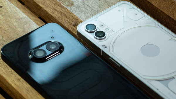
Phone (2a) changes the camera placement from the upper left corner to the top middle
The immediately eye-catching component is of course that transparent rear panel allowing you to glimpse at the copper coil, etched circuit boards and precisely laid out cameras within. It's a stunning design flourish that sparks curiosity and exudes technical warmth as per Nothing's philosophy. The updated trio Glyph light configuration running across the centre back adds another layer of visual intrigue.
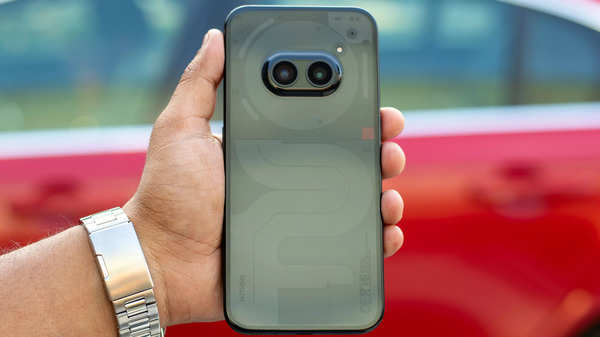
<p><em>This design gives the phone a smoother and more unified appearance.</em><em></em><br></p>
But the Phone (2a)'s transparent styling ultimately serves more purpose than pure aesthetics. Nothing has cleverly integrated several key components like the logic board and antennas placed strategically to create an anthropomorphic 'face,' giving the device a distinct personality. Well, the trio-led Glyph lights running down the phone's rear centreline and punctuated camera lenses should grab your fickle attention.
The glyph interface lights also grab attention with their charming twinkles and flashes denoting notifications, alerts and various other functions. Nothing has updated the glyph layout on the Phone (2a) to an asymmetrical trio of lights compared to the plethora of LEDs on previous phones. This new configuration looks much simpler and subtle to the eyes and might have wider appeal than the previous iterations.
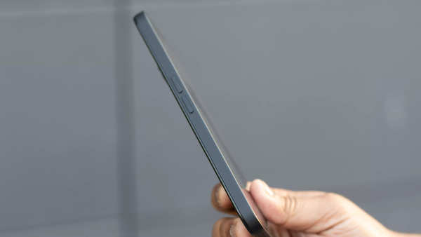
Phone (2a) has more rounded corners compared to previous Phone (s)
Beyond the transparency and glyphs that make the Phone (2a) truly unique, there are several other design refinements over previous Nothing phones. The mid-frame features smooth rounded corners, curved back and is weighed properly, so the phone sits nicely in the hand. The asymmetrical chassis flows seamlessly into the circular camera module through a 90-degree unibody cover wrap.
Just one thing to note is that the back and the mid-frame are made out of plastic, though that might be good news if you drop your phone a bit since it won't break like glass; it also means the phone is more prone to scratches.
The camera bump now sits in the centre, changed from the top-left corner position, and seamlessly into the quirky top-bottom asymmetric rear chassis. Water and dust resistance rating has been upgraded to IP54 for basic splash proofing. The whole phone exudes a premium yet fun vibe.
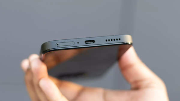
L-R: SIM card slot, microphone, USB-C port, and the speaker grille on Phone (2a)
Just like the two phones before, this one also comes in two colours – White and Black – the safest colours there could be. Both options undoubtedly exude their aesthetic appeal. That said, the translucent design flourishes tend to shine brightest in White hues. The transparency effect gets somewhat muted against Black trim, slightly dampening that signature Nothing flair. Of course, this subtle nuance boils down to subjective taste.
Glyph
Integral to making Nothing phones unmistakable is the ingenious Glyph Interface adorning the rear panel. Yes, there are fewer LEDs compared to the last two phones but they are still very much customisable, playful and even more practical.
Nothing gives full control over Glyph Interface behaviour based on situations. You can control brightness, set specific activation hours, schedule bedtime for do not disturb mode or simply have them turned off when unneeded.

Left: Phone (2a); Right: Phone (1)
An Essential Mode smartly prioritises only your most important apps or contacts with persistent lighting until opened. There are ten additional notification sounds/ effects you can assign for varied Glyph responses. The music visualiser mode has hypnotic lights pulsing and dancing to beats or melodies playing through phone speakers. Glyph lights also indicate charging status, activate while using the front flash as fill light or initiate countdown timers.
Compared to the last two generations of Nothing Phone (s), the Phone (2a) has only three strips on the top of the back around the camera sitting in the centre. And if said honestly, this arrangement is not very much on-to-your-face, unlike how many would have felt about the Glyph on the last two phones so that this design might fare well with the mass, and that's what the Pei and co. want.
Display
Phone (2a) has slimmer bezels than the Phone (1), and uniform through all sides
While striking aesthetics may be the first aspect that grabs your attention, the Phone (2a) doesn't cut corners when it comes to display. Front and centre on the Phone (2a) is a generously-sized 6.7-inch FHD+ flexible AMOLED display. While not quite flagship resolution, you’d be hard-pressed to notice any real downgrade in clarity coming from a 1440p panel. Text and UI elements appear perfectly sharp thanks to a pixels per inch (PPI) count of 394.
The colour accuracy is pretty good. The phone can display up to 1.07 billion colours, and the colours do appear punchy out-of-the-box, though manual tuning is available. Since it is an AMOLED, the Always On Display is always there. The only miss is the lack of HDR10+ support and
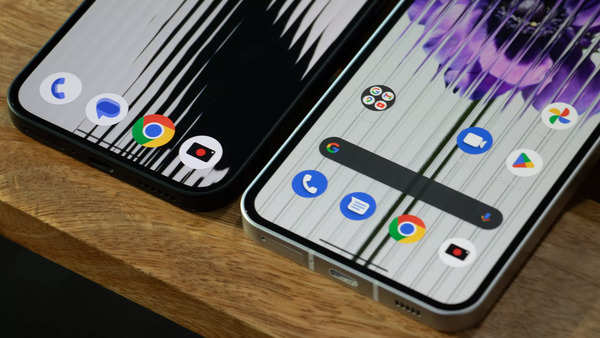
Just look at those slim bezels on Phone (2a)
The AMOLED panel gets remarkably bright – up to 1300 nits, ensuring easy outdoor visibility. The 120Hz dynamic refresh rate, which means that the display can switch the refresh rate between 30-120Hz depending on the content. produces, so you get fluid animations and scrolling. There's Gorilla Glass 5 on top, too, so you are somewhat safe of accidental scratches and drops.
Performance
Powering the Phone (2a) is
MediaTek
’s
Dimensity 7200 Pro
SoC, which Nothing says has been made specifically for its new phone. Fabricated on an efficiency-focused 4nm process, you get an octa-core CPU with a maximum of 12GB of LPDDR5 RAM and up to 256GB of storage.
The Phone (2a)'s day-to-day speed absolutely backs up the 7200's hype. Out of the box, the performance felt peppy and responsive. Everything from having over 15 apps open simultaneously to quickly shuffling between was impressive. The same proved true for gaming. Though there was some occasional lag initially after we set up the phone, it did get better after a while. Clearly, Nothing worked closely with MediaTek to tune both hardware and software.
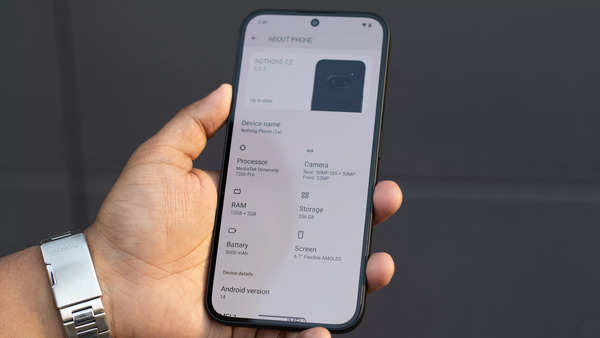
About Phone (2a)
Nothing significantly improved on the traditionally iffy memory management by coding a smarter solution dubbed "Smart Clean" which constantly scans background services for dormant memory usage then forcibly clears caches and frees up resources thereby maintaining the same rapid app reload speeds even after extended uptime - a clever bit of preventative maintenance if say so.
Complementary to Smart Clean, the Phone (2a) also employs something called "RAM Booster," which dynamically converts a portion of free internal storage into virtual RAM your apps can tap into when physical memory fills up, helping maintain critical software keepalives for multitasking heavy workloads. Then you've got proprietary "NTFS optimisations" for doubling file transfer throughput between the (2a) and Windows PCs compared to standard Android implementations for NTFS support - great news for folks who frequently shuffle large volumes of data back and forth!
OS
The Phone (2a) ships with Nothing OS 2.5, a clean and minimal software experience built on Android 14. Nothing OS has matured nicely over successive iterations into a uniquely personal take on pure Android. Version 2.5 shipping on the Phone (2a) retains the same refined focus on delivering an uncluttered, unified experience, putting you firmly in control.
As soon as you boot up the phone, the absence of bloat and preloaded apps is welcome. There's no unnecessary duplication of apps or services to muddy waters. Just a thoughtfully designed canvas awaiting your customisations.
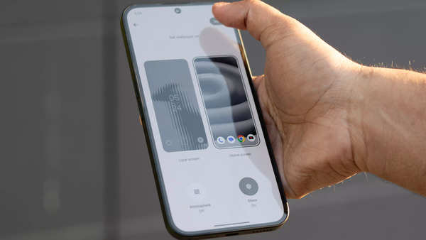
Nothing OS wallpapers passes the vibe check
Daily interactions impress with the level of polish Nothing exhibits across system animations, transitions, and UI elements. Small touches like custom battery charging animations or redesigned media notifications demonstrate attention to detail often missing in this price bracket.
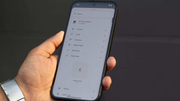
Plenty of widgets in here
There is a whole lot of customisation available. For beginners, one can either choose the stock user interface or Nothing’s transparent launcher. You still get an app drawer, plenty of toggle options, and home screen widgets. Proprietary Nothing widgets are especially well made - offering useful info while matching aesthetics. Favourites like Music playback, weather overview, camera shortcuts and more at your disposal. And if nothing matches your taste, you still have the option to use third-party launchers.
As mentioned earlier, the Phone (2a) launches with Android 14 underneath, and Nothing promises 3 years of OS updates. While it is not as much as what Google now offers for Samsung, that’s exceedingly generous for an affordably priced smartphone.
TL;DR? The Phone (2a) has enough oomph to satisfy demanding users, prioritising responsiveness and longevity.
Camera(s)
Nothing has retained its “less is more” philosophy with the Phone (2a)’s camera system. So, no absurd 108MP camera rubbish or cynical lens redundancy to inflate hardware specs. The Phone (2a) keeps things simple, consisting of just two sensors – a 50MP wide and 50MP ultra-wide camera.
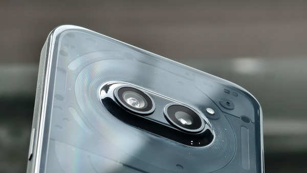
The two 50MP cameras on Phone (2) sitting inside the NFC coil
As for components, the main 50MP sensor rocks a reasonably large 1/1.56" footprint with dual pixel PDAF plus OIS (Optical Image Stabilisation) thrown in. Over on the secondary ultra-wide camera, Nothing equips an equally beefy 50MP sensor mated to an f/2.2 aperture stepping back to a pleasantly expansive 114-degree field of view.
Impressive on paper? Sure. But how do these shooters translate over to real-life imaging prowess? In a word: delightfully.
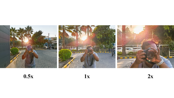
In daylight conditions, the main and ultra-wide cameras captured sharp, detailed handheld photos with accurate white balance and vibrant yet natural colour rendering. The green hues had a lush depth, and skin tones looked richly natural without excessive HDR effects or sharpening artefacts. One thing to note is that sometimes, especially when pictures against the bright light, the shots come out a little too processed.
You can also click portraits with the Portrait mode that mimics the bokeh perfectly, in addition to plenty of detail. There's an "Expert" mode, essentially Nothing's name for the Pro mode, too, if you want to get too deep.
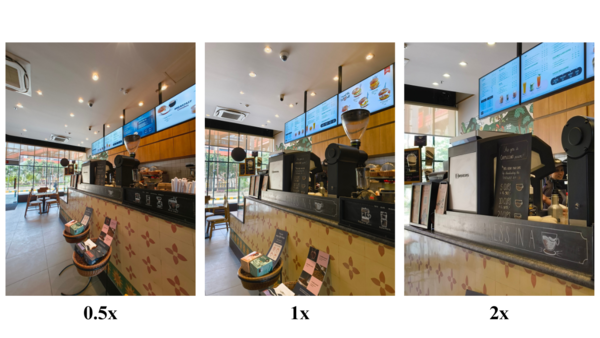
The camera performs just fine in low-light and dimly lit environments. Interior shots had balanced exposures that captured intricate textures and details. Even in heavily backlit portrait shots with harsh shadows, the camera managed to restore facial features that would appear as indistinguishable silhouettes on many other phones in this price range. The
The selfies captured on the 32MP front camera come out fine, too.
The Phone (2a) can also shoot crisp 4K video at 30 fps with the help of Optical Image Stablisation and Electronic Image Stabilisation, making footage appear incredibly smooth and steady. Slow motion capture at up to 120fps is a creative bonus.
All said, while Nothing doesn’t chase marketing gimmicks like 100MP sensors, the Phone (2a) delivers where it truly counts - good quality for both photos and videos.
Battery life
The Phone (2a) packs Nothing’s largest battery yet at 5000mAh. Even if you are someone who’s always on their phone, you can easily sail through 1.5-2 days of use on a full charge.
When you do run low and need to recharge in a pinch quickly, the 45W fast charging is the thing you need. A completely empty battery reached 50% in just 21 minutes and hit 100% in exactly 58 minutes! Though, do remember that you’d need a compatible charger for this speed and Nothing does not give one in the box. Then, there’s no wireless charging supported, which is a miss but can’t be considered a con, given its price.
Verdict
After testing the Phone (2a) for over two weeks, it can be said with certainty that this isn't just some bland gimmick trading on transparent shells and glitzy lights to attract attention. The hardware is legit, the features are incredibly well thought out, and the overall experience for the price will push one to ask: "Why can't more phones be this thoughtfully designed?” It is the breath of fresh air mid-range segment needed.
The Phone (2a) delivers excellent build quality, a brilliant 120Hz OLED display, a dependable performance with a software that gets out of your way, versatile camera setup, all-day battery life and fast 45W charging – at just Rs 23,999. When you further sprinkle that X-factor stemming from transparent design and quirky personalised Glyph, the Phone (2a) becomes a downright delightful proposition. (Though, you need to add the cost of buying the charger, which is the only con the Phone (2a) has against it)
With all its wild lights, exposed internals, and quirks, is this the Phone (2a) worth. The short answer is? Indeed, it is for its price! The Phone (2a) strikes a perfect balance between style and substance. It's a clear upgrade for the Phone (1) owners, who either didn't switch to the Phone (2) or find it a little expensive. And, for those looking for a new affordable phone, the Phone (2a) is the one.




 English (US) ·