Sure, your real estate landing pages look great — but do they convert? A good real estate website includes more than just drool-worthy images of homes priced to sell. Your real estate website should serve multiple functions, almost like a digital business card with an MLS listing storefront, a booking platform, a home valuation page, and even your background story and biography.
Most importantly, your website should be designed with prospective clients in mind, giving them the exact information they need and steps to get in touch. Because at the end of the day, you can judge a website’s effectiveness (and your ROI) on one thing: its ability to convert leads.
Before you hire a copywriter or enlist ChatGPT to help you write catchy phrases and descriptions, review our guide covering the key elements that every real estates landing page should have, plus a few dazzling examples.
Tips for effective real estate landing pages (plus examples that got it right)
Tip #1: Cater your pages to your target audience
One of the most obvious traps that new real estate agents fall into is making their website all about me, me, me. Remember — your prospective clients are glancing through dozens of agents’ websites. While they do care about finding the right fit, they are also looking for information that solves their most pressing problem: buying or selling a house.
Yes, share information about your background, personal interests and professional qualifications — but not without first acknowledging how you can help the reader on the other end.
Start by covering the basics: Who you are, what region you serve, what types of properties and clients you represent. Then acknowledge their pain points by showing exactly how you can help them. Use quantifiable data, such as your total volume of sales or number of years in the business, to demonstrate your credibility.
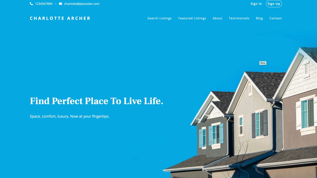
Check out this example:

This Placester real estate landing page caters to buyers looking for listings. Notice how the biggest heading on this landing page directly addresses the audience’s desires? The agent’s name, Charlotte Archer, is tastefully included in the top left hand corner, but the focal point keeps the attention on what the website visitors are looking for — finding the perfect, most comfortable place to live, and searching for listings.
Tip #2: Use a clean but striking layout
The design of your website should be clean, professional and easy to navigate. Use a visually appealing color scheme that aligns with your branding guidelines. While it’s helpful to use memorable images and highlight colors, balance artistic style with functionality. Make sure your visitors can easily follow the flow of information and navigate the site with ease.
Check out this example:
Using a Luxury Presence website template, Austin-based Realtor® Kumara Wilcoxon showcases several stunning images and professional portraits. Yet, her navigation is clear: Her website features a simple menu toolbar, professional stats such as total 2023 sales volume, links to press, a newsletter signup sheet, a custom home valuation tool and links to available properties. Seems pretty easy to navigate, with plenty of options to keep visitors clicking around on the page.
Tip #3: Feature inspiring imagery
People prefer aspirational images when shopping for their next home. High-quality photos and video walkthroughs are therefore crucial when planning your real estate landing pages. Use professional, high-resolution photos of the types of properties you represent, along with photography and video that captures the feel of the neighborhood and surrounding area. Don’t forget to include plenty of personable headshots of yourself, too!
Check out these examples:
This boutique brokerage features stunning, expansive property from all angles on their Luxury Presence website. Featuring overhead drone shots and well-produced embedded YouTube videos, this real estate landing page leaves nothing to the visitor’s imagination, inviting them to think big about their next move.
Tip #4: Prioritize SEO
Pick a website builder that optimizes for Google search engine, helping you increase visibility with small but important details. To start, find an option with fast page-loading times (search crawlers prioritize fast pages). When writing your copy, include relevant keywords that your ideal client might be looking for. For instance, if you live in the Bay Area, include the phrase “Bay Area real estate agent” when convenient.
Also update the alternative description field for all site images, as well as the metadata descriptions of any landing pages and blog posts. These might feel like trivial details, but just these small bits of added text help search engine crawlers understand the content of your real estate landing pages and drive traffic to them.
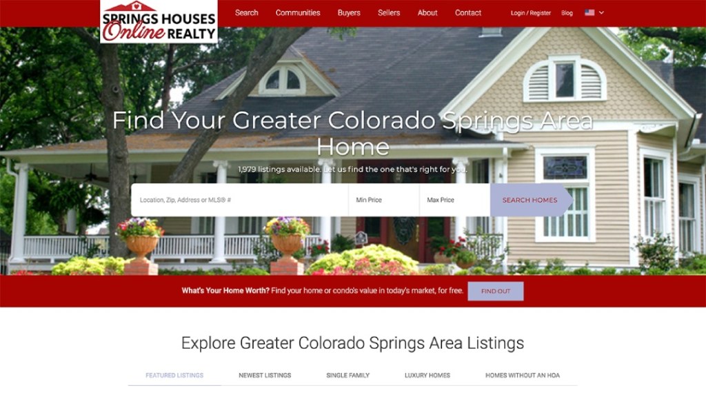
Check out this example:

This Colorado-area brokerage uses a template from Sierra Interactive, which boasts a fast load time and tools built specifically to boost organic SEO traffic. Notice the headings like, “Colorado Springs Area Home” and “Greater Colorado Springs Area Listings” ? Chances are, this website copywriter knew exactly what they were doing to attract readers searching for those terms.
Tip #5: Email capture
Include a feature for visitors to sign up for you rnewsletters, property alerts or customized monthly market reports. Adding an incentive or valuable giveaway to your real estate landing page helps you collect email addresses and serve your prospective clients year-round. When the time is right, they will reach out to inquire about your services. Until then, they will stay informed and in the loop!
Check out this example:

This template from iNCOME features a website widget where users can input their email address to receive a free real estate report for their area.
Tip #6: Use responsive design for all devices
Your website should be accessible and look good on all devices and browsers, including desktops, tablets and smartphones. Responsive design enables this by adjusting the page’s formatting and orientation to fit the scale of any screen width without distorting banner images or messing up the font.
Check out this example:
Responsive design is what allows the same website to instantly reformat to mobile size, without blurring the gorgeous background image or cutting off any of the text. While Squarespace isn’t specifically for real estate agents (and has limited capabilities for an MLS feed), it’s great for a new agent who simply wants a user-friendly, easy to launch website with attractive branding.
Tip #7: Include easy-to-find contact info
Make sure your contact information is prominently displayed and easy to find. Include your phone number, email address or a simple contact form (not too lengthy) for visitors to request a meeting with you.
Check out these examples:
We reviewed dozens of agent, team and brokerage websites while writing this article. We found that many of them made getting in touch really challenging. We love this clean contact form on Agent Image‘s website built for The Oppenheim Group in Southern California. Also, their social media icons float enticingly at the lower right of every site page, along with a bright red “chatbot” symbol at bottom left, making it very easy for site visitors to get in touch with you.
In the second template examples from Agent Image, you’ll find three key calls-to action: one for buyers, one for homeowners looking to sell, and one inviting site visitors to join your mailing list.
Tip #8: Proudly display your branding
Repetition is one of marketing’s magic ingredients. Adding your brokerage or individual agent branding to your real estate website will give it a polished look, plus train visitors to keep an eye out for your logo and company name.
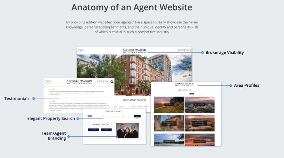
Check out this example:

This dynamic Propertybase website template features it all: client testimonials, an IDX property search bar, regional area profiles and professional headshots. But one element remains consistent: the brokerage logo. Similarly, you should use a real estate landing page builder that features a space for a branded logo at the top, bottom and throughout your website.
Tip #9: Write excellent, captivating copy
How do you write catchy copy for your real estate landing pages? It starts with clean, effective copy. Every page needs a purpose, and every word on that page should drive visitors to take a specific action.
Generally speaking, copy should follow this logic flow:
1. Your home page should introduce the basics: Who, what, when, where, why, etc. What are you, your brokerage or team all about? Where are you licensed to do business?
2. Address your clients’ pain points. Use language they would understand, speaking directly to their desires. Use short, active sentences with words like “ease,” “luxury,” “trusted,” and so on.
3. On your about page, and throughout your real estate landing pages, paint visitors a picture of how wonderful it is to work with you. But don’t be too superfluous — people value direct honesty, not fluff.
4. Your calls to action (CTAs) should be clear and direct, too. Encourage your website visitors to take the next step from your real estate landing pages, whether it’s scheduling a property viewing, requesting a home valuation, signing up for your newsletter or contacting you for more information.
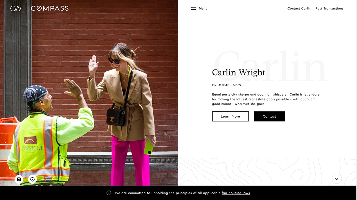
Check out this example:

New York-based real estate agent uses a humorous and relatable approach to her Luxury Presence-designed website copy, self-describing as a “sherpa” and “doorman whisperer.” But then, she uses the word “legendary” to describe her ability to make clients’ goals a reality, adding to her trustability.
Bonus: One agent’s DIY landing page advice
If you’re feeling intimidated about how to write real estate website copy, South Carolina-based agent Laura Sinclair offers some advice. “I wrote all of the copy on my website myself,” she told HousingWire. “I spent a lot of time thinking about my ideal client’s pain points and writing copy that would let them know I see their frustration and have a solution.”
She believes that effective communication arises when agents step into their clients’ shoes — which can be a challenge while juggling so many responsibilities. “It can be difficult as a business owner to remember what’s going on in our client’s mind,” she said. But her top recommendation for writing real estate landing pages is to treat them like an online storefront, capturing visitors’ interest and offering expert guidance.
You have to know your client and your services so well that you can speak to them both very concisely and leave people wanting more from you.

Laura Sinclair
Licensed Real Estate Agent
She also emphasized the need to differentiate yourself from generic listing marketplaces by adding a signature touch: “Home search is usually the primary content on agent websites — and while that is what consumers want, a vast majority of them have that need already filled with the professional search sites like Zillow and Realtor.com.”
The solution? Be memorable. “Give them a reason to get into your ecosystem before they leave.”


 English (US) ·